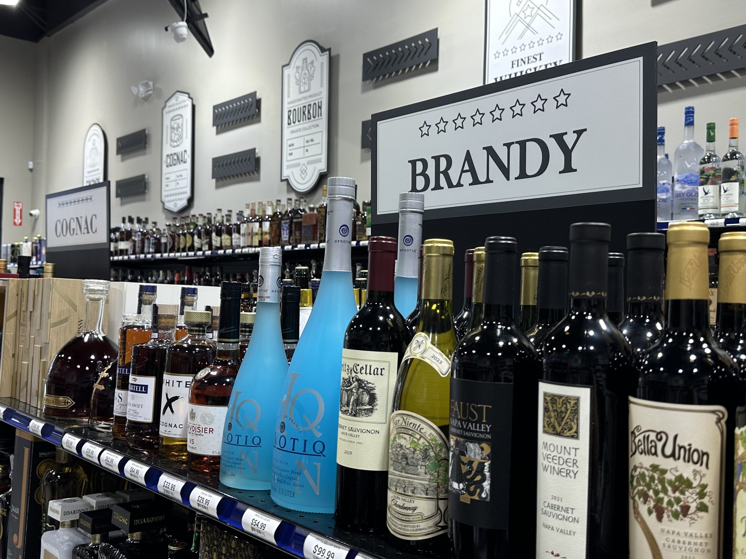
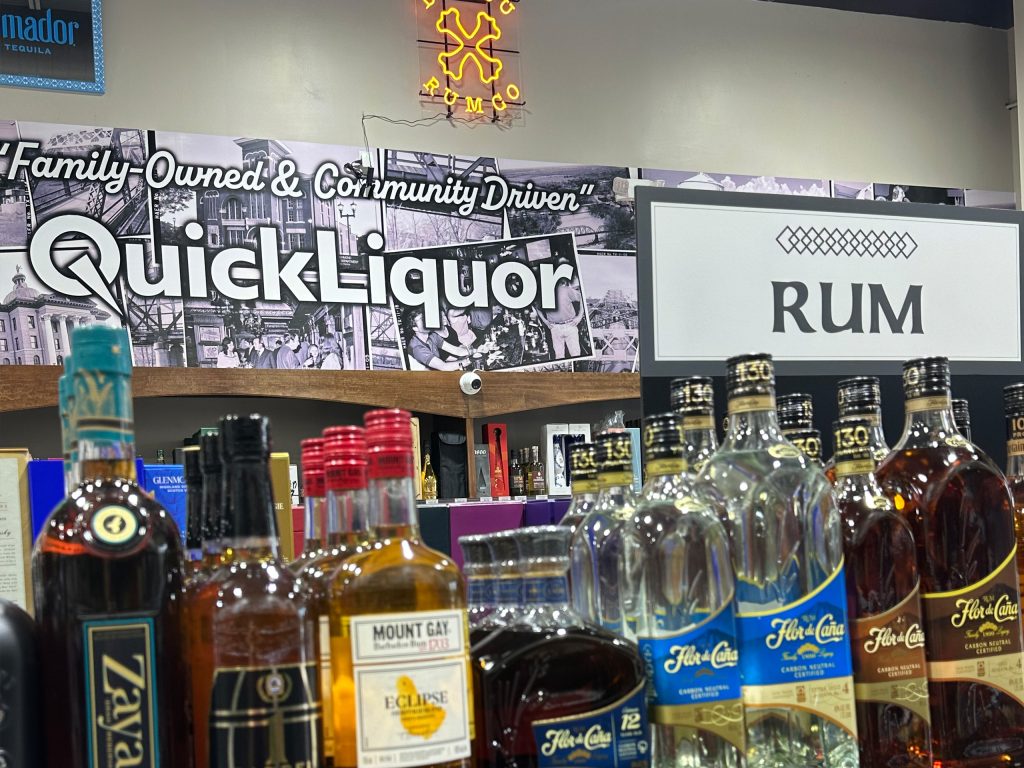
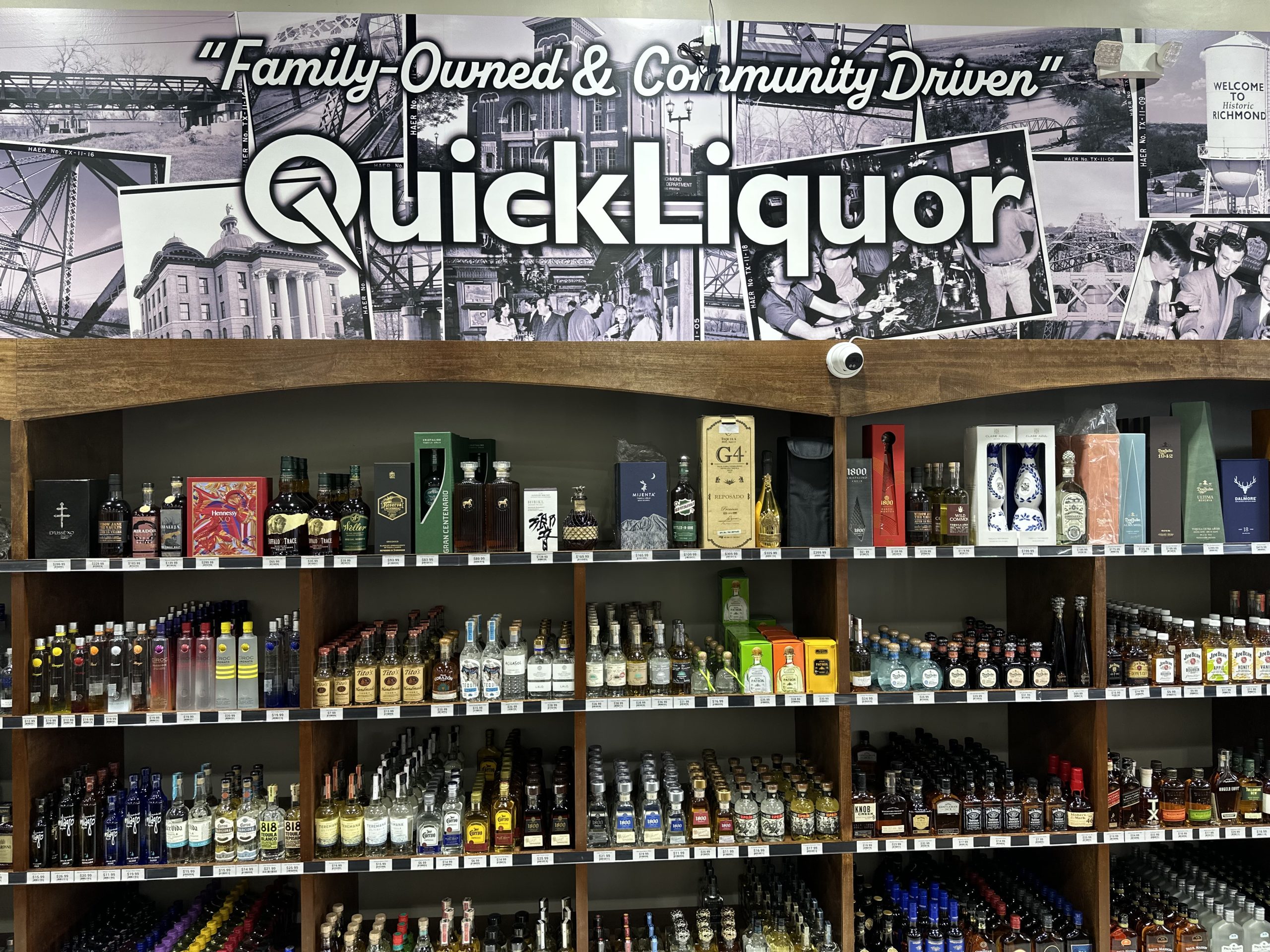
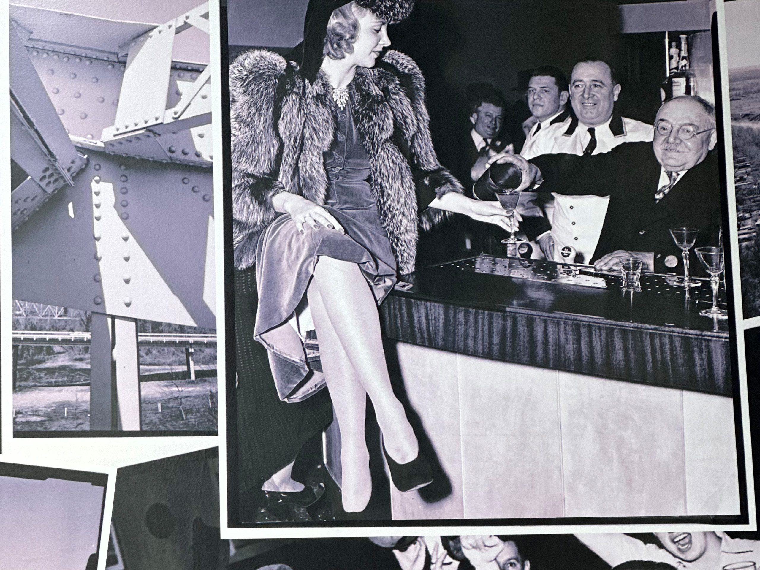
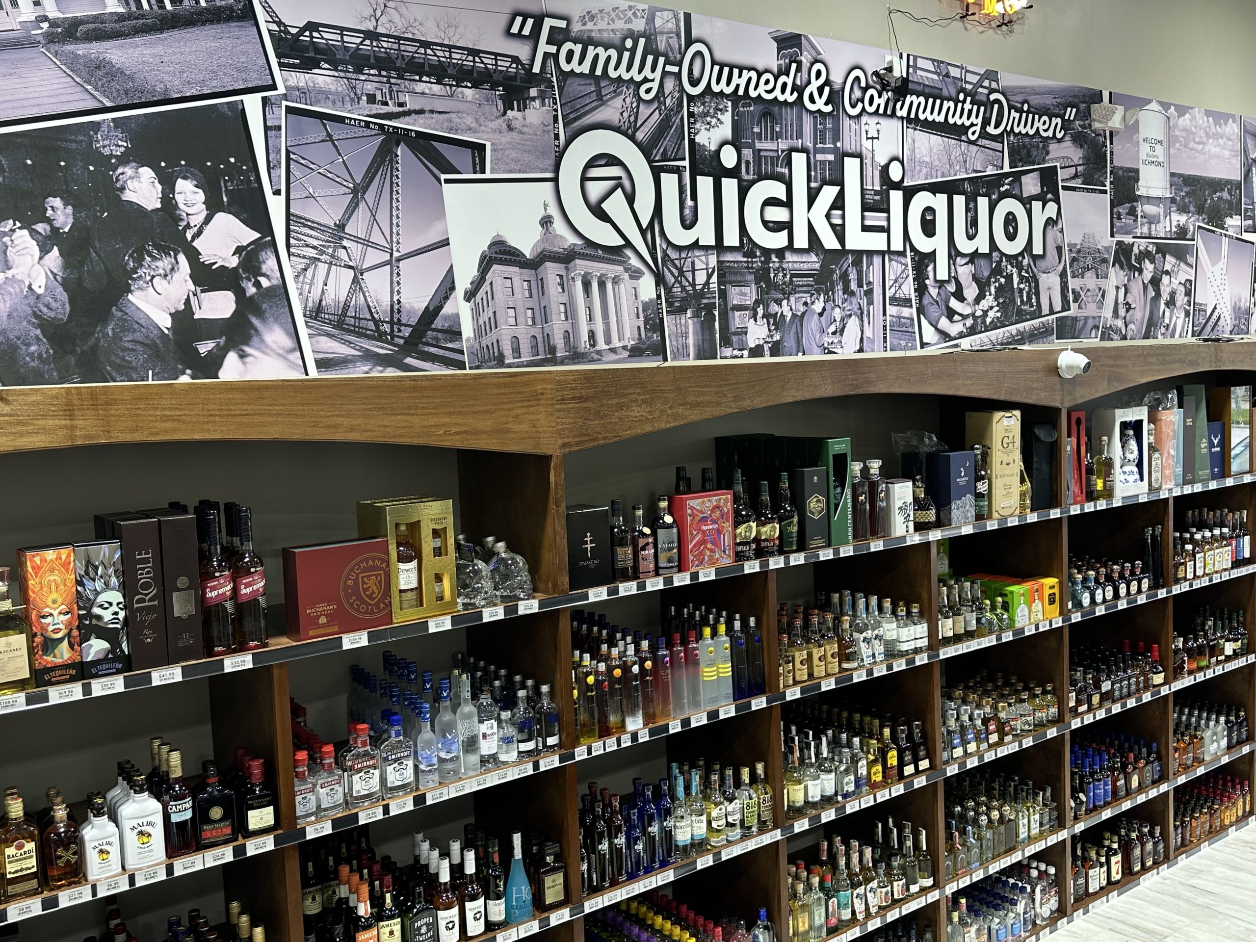
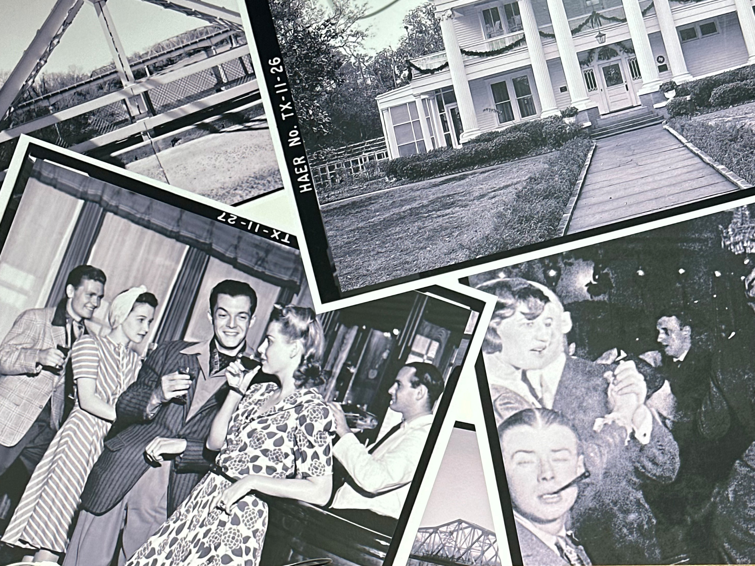
Crafting a Brand Identity That Blends Rustic Charm with Modern Appeal
Quick Liquor
Overview
Quick Liquor is a brand-new liquor store aiming to grow into a successful franchise. As an extension of the established convenience store “Quick Buy,” this first location needed a strong, cohesive brand identity and environmental graphics that would set the tone for future stores. The project involved full design and installation of interior graphics and wayfinding elements to create a memorable customer experience.
Challenge
The client wanted to preserve the rustic, retro feel of the original convenience store while giving the liquor store a fresh, modern look. This balance needed to be carefully crafted so the brand could be easily replicated across future locations, yet still stand alone as a unique space. Additionally, clear wayfinding signage was required to help customers navigate the store effortlessly, enhancing both function and style. A unique element was incorporating local history to reinforce their slogan: “Family Owned and Community Driven.”
Solution
Our design team developed a creative approach that merged retro aesthetics with modern design cues. We centered the concept around minimalistic retro bottle labels representing different spirits—vodka, rum, tequila, whiskey, and more. Each label doubled as a wayfinding sign, guiding customers while reinforcing the brand identity. The color palette was inspired by modern English tones, striking the perfect balance between old and new.
To emphasize the “Family Owned and Community Driven” slogan, we installed a large black-and-white collage of historic town photos above the cashier, including vintage scenes of people enjoying drinks. This blend of nostalgic imagery and clean modern design achieved the desired rustic-retro-modern atmosphere.
Throughout the process, we collaborated closely with Quick Liquor, incorporating feedback and ensuring the design aligned perfectly with their vision.
Result


Owner Testimonial